Color Theory Guide for Beginners Master Design Fundamentals at RedSketch Academy

Colors are more than just visual elements — they are powerful tools of communication. A well-chosen palette can spark emotions, tell stories, build brand identities, and even influence buying decisions. For designers, mastering color theory is not optional; it's an essential skill.
But here's the good news: you don't need to be an artist or scientist to understand color. With the right principles, you can use color theory to create designs that look professional, balanced, and engaging.
In this guide, we'll cover the fundamentals of color theory every beginner designer should know — from the color wheel and harmony rules to psychology, branding, and practical applications.
The Basics: What Is Color Theory?
Color theory is the science and art of using colors. It explains how colors interact, how they can be combined, and how they affect human perception.
At its core, color theory helps designers answer questions like:
Think of it as your roadmap to designing with purpose.
Understanding the Color Wheel
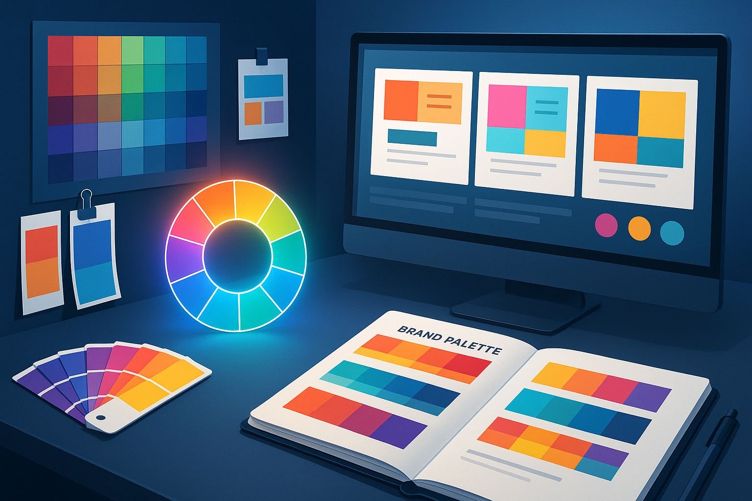
The color wheel is the foundation of color theory. It organizes colors in a circular format to show relationships between primary, secondary, and tertiary colors.
Primary Colors
Red, Blue, Yellow → The building blocks
Secondary Colors
Green, Orange, Purple → Created by mixing primaries
Tertiary Colors
Red-Orange, Blue-Green, etc. → Mix of primary + secondary

Always keep a color wheel handy when creating palettes — it's your cheat sheet for harmony.
Color Harmony: Making Colors Work Together
Color harmony creates balance and beauty in designs. Here are common harmony rules:
Monochromatic
Different shades and tints of a single color → Clean and elegant
Analogous
Colors next to each other on the wheel → Calm and natural
Complementary
Opposites on the wheel → High contrast, vibrant
Triadic
Three evenly spaced colors → Bold and dynamic
Fast-food brands often use red + yellow (complementary/triadic) to grab attention and stimulate appetite.
The Psychology of Colors
Colors affect emotions and behavior. Designers use this psychology to communicate without words.
Red
Energy, urgency, passion
Used in: Sales banners, food brands
Blue
Trust, calm, professionalism
Used in: Banks, tech brands
Green
Growth, nature, health
Used in: Eco, wellness, finance
Yellow
Optimism, warmth, creativity
Used in: Youth brands, entertainment
Purple
Luxury, wisdom, imagination
Used in: Beauty, premium products
Black & White
Power, sophistication, simplicity
Used in: Luxury fashion, tech, healthcare
Always match your color choice to your message and audience.
Warm vs Cool Colors
Warm Colors
Reds, oranges, yellows
→ Energetic, exciting, attention-grabbing
Cool Colors
Blues, greens, purples
→ Relaxing, calming, professional
Design Tip: Designers often combine both warm and cool colors to create contrast and balance.
Using Contrast and Balance
Contrast makes elements stand out. Balance keeps the design pleasant to view.
Golden Rule: Use the 60-30-10 Rule
Dominant color
Secondary color
Accent color
Color in Branding
Brands use color to become memorable. For example:
Coca-Cola
Red = Excitement, passion
Blue = Trust, connection
Starbucks
Green = Growth, nature, balance
As a designer, always think: What emotion or value should this brand communicate through color?
Accessibility and Inclusive Design
Not everyone sees color the same way (e.g., color blindness). Designers in 2025 focus on inclusive design by:
Accessibility isn't just ethical — it's professional.
Digital vs Print Color Modes
Understanding color modes is crucial:
RGB
Red, Green, Blue
Used for: Digital screens, websites, apps
CMYK
Cyan, Magenta, Yellow, Black
Used for: Printing, packaging
Always set the correct mode before starting a project to avoid color mismatch.
Practical Tips for Beginners
Common Mistakes to Avoid
Frequently Asked Questions
Q1. Why is color theory important for beginners?
👉 Because it makes your designs look intentional and professional, not random.
Q2. What is the easiest color harmony for beginners?
👉 Monochromatic or analogous palettes — safe and elegant.
Q3. Can I use AI tools to create color palettes?
👉 Yes! AI-powered tools like Adobe Firefly and Coolors AI generate palettes based on moods, themes, or images.
Q4. How do I choose colors for branding?
👉 Start with the brand's personality → pick colors that match the values and audience emotions.
Conclusion
Color is one of the most powerful design elements. When used correctly, it enhances communication, builds brand identity, and evokes strong emotions. For beginners, mastering color theory is the first step toward becoming a confident, job-ready designer.
👉 Take Control of Color. Take Control of Design.
At RedSketch Academy, our Digital Graphic Design Course and Next-Gen Graphic Design Mastery (AI Edge) program dive deep into color theory, Photoshop, Illustrator, Figma, and branding essentials. You'll learn not just theory but how to apply it in real-world projects, with 100% job guarantee and lifetime creative support.
Related Design Education & Resources
Common Design Mistakes to Avoid
Learn the most common design pitfalls beginners face and how to avoid them in your projects.
Essential Design Tools for 2025
Discover the latest design tools and software that every modern designer should master.
Graphic Design Trends 2025
Stay ahead with the latest design trends and visual styles shaping the industry this year.